CSS Grid

By Emmanuel Chinonso
Web Developer
CSS Grid
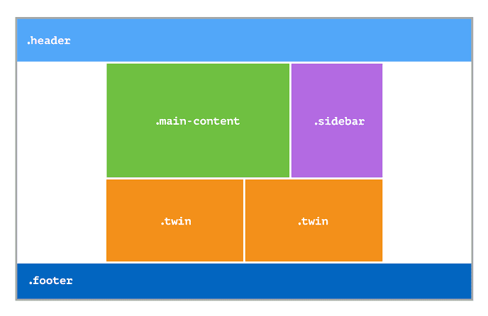
The CSS Grid Layout Module offers a grid-based layout system with rows and columns, making it easier to design web pages without using floats and positioning.
Display Property: An HTML element becomes a grid container when its display property is set to grid or inline-grid.
CSS Code:
.grid-container { display: grid;}All direct children of the grid container automatically become grid items. The vertical lines of grid items are called columns, while the horizontal lines of grid items are called rows. The spaces between each column/row are called gaps. The grid-column-gap property sets the gap between the columns:
CSS Code:
.grid-container { display: grid; grid-column-gap: 50px;}The grid-row-gap property sets the gap between the rows:
CSS Code:
.grid-container { display: grid; grid-row-gap: 50px;}The grid-gap property can also be used to set both the row gap and the column gap in one value.
CSS Code:
.grid-container { display: grid; grid-gap: 50px;}The lines between columns are called column lines. The lines between rows are called row lines.
Build modern projects using Bootstrap 5 and Contrast
Trying to create components and pages for a web app or website from
scratch while maintaining a modern User interface can be very tedious.
This is why we created Contrast, to help drastically reduce the amount of time we spend doing that.
so we can focus on building some other aspects of the project.
Contrast Bootstrap PRO consists of a Premium UI Kit Library featuring over 10000+ component variants.
Which even comes bundled together with its own admin template comprising of 5 admin dashboards and 23+ additional admin and multipurpose pages for
building almost any type of website or web app.
See a demo and learn more about Contrast Bootstrap Pro by clicking here.
Related Posts


