Bootstrap 5 Sidebar-How to create a Responsive Bootstrap 5 Sidebar

By Amarachi Iheanacho
Technical Writer
Bootstrap Sidebar
Sometimes, there are pieces of information in a column to the right or left of the main content in a website layout. This column is known as a sidebar.
Bootstrap 5 Sidebars are a User Interface element ( usually a column to the left ) containing supplementary information, like navigation links or ads.
Table Of Contents
- What are we building?
- Prerequisites
- What is Contrast bootstrap 5 UI?
- Creating our Bootstrap 5 Sidebar
- Conclusion
- Resources
What we are building
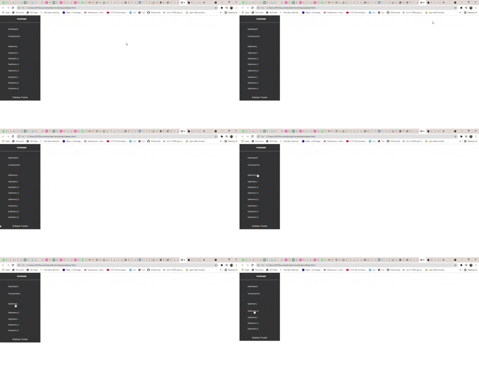
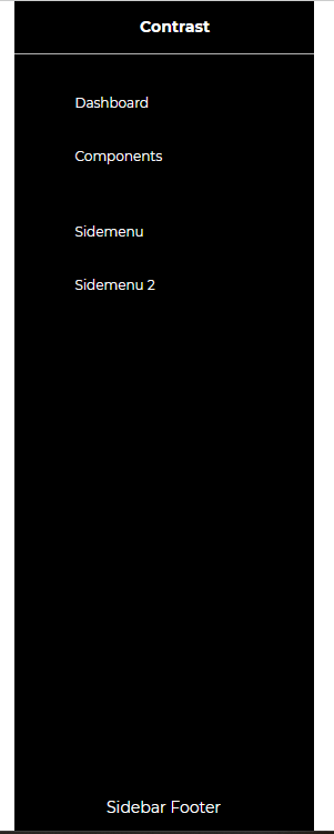
In this article, we are going to walk through building a Bootstrap sidebar with Contrast. Like the image we have below:

Prerequisites
To make the most of this article, you must have the following:
- A basic understanding of HTML.
- A basic understanding of CSS.
- A basic understanding of JavaScript
Understanding what Contrast Bootstrap 5 UI is?
Contrast or Bootstrap 5 UI kit is an elegant bootstrap UI kit featuring over 2000+ essential components. Contrast helps simplify the web development process and can be integrated with any project to build mobile-first, responsive, and elegant websites and web apps.
Adding the Contrast bootstrap 5 library CDN
We will be using the Contrast bootstrap 5 libraries to build out our Bootstrap 5 Sidebar. To do that we start by including the library in our project using the Bootstrap CDN.
We include the CSS CDN responsible for the Bootstrap styling in the <head> in our HTML file.
<link rel="stylesheet" href="https://cdn.jsdelivr.net/npm/cdbootstrap/css/bootstrap.min.css" /><link rel="stylesheet" href="https://cdn.jsdelivr.net/npm/cdbootstrap/css/cdb.min.css" />After including the CSS CDN links, we then include the JavaScript CDN responsible for creating dynamic components at the bottom of our project. We do this because we want our components before adding the functionality.
<script src="https://cdn.jsdelivr.net/npm/cdbootstrap/js/bootstrap.min.js"></script><script src="https://cdn.jsdelivr.net/npm/cdbootstrap/js/popper.min.js"></script><script src="https://cdn.jsdelivr.net/npm/cdbootstrap/js/cdb.min.js"></script>After adding the CDNs our HTML file should look like this
<!DOCTYPE html><html lang="en"> <head> <meta charset="UTF-8" /> <meta http-equiv="X-UA-Compatible" content="IE=edge" /> <meta name="viewport" content="width=device-width, initial-scale=1.0" /> <link rel="stylesheet" href="https://cdn.jsdelivr.net/npm/cdbootstrap/css/bootstrap.min.css" /> <link rel="stylesheet" href="https://cdn.jsdelivr.net/npm/cdbootstrap/css/cdb.min.css" /> <title>Document</title> </head> <body> <script src="https://cdn.jsdelivr.net/npm/cdbootstrap/js/bootstrap.min.js"></script> <script src="https://cdn.jsdelivr.net/npm/cdbootstrap/js/popper.min.js"></script> <script src="https://cdn.jsdelivr.net/npm/cdbootstrap/js/cdb.min.js"></script> </body></html>Creating our Bootstrap 5 Sidebar
With Contrast Bootstrap 5 UI kit we can create 2 kinds of sidebars
- Default Sidebar
- Multilevel Advanced Sidebar
Default Sidebar
<div class="mx-auto r-w">  <div class="container">    <div class="app" style="display: flex; height: 100%; position: absolute">      <div class="sidebar bg-dark text-white" id="sidebar-showcase" role="cdb-sidebar">        <div class="sidebar-container">          <div class="sidebar-header text-center">            <a class="sidebar-toggler"><i class="fa fa-bars"></i></a>            <a class="sidebar-brand">Contrast</a>          </div>
          <div class="sidebar-nav">            <div class="sidenav">              <a class="sidebar-item">                <i class="fa fa-th-large sidebar-icon"></i>                <span>Dashboard</span>              </a>              <a class="sidebar-item">                <i class="fa fa-sticky-note sidebar-icon"></i>                <span>Components</span>              </a>            </div>
            <div class="sidenav">              <div class="sidebar-dropdown">                <div                  class="sidebar-item"                  data-toggle="collapse"                  data-target="#collapseOne"                  aria-expanded="true"                  aria-controls="collapseOne"                >                  <i class="fa fa-th sidebar-icon"></i>                  <span>Sidemenu</span>                  <i class="fa fa-angle-right arrow-wrapper ml-auto"></i>                </div>              </div>              <div class="sidebar-dropdown">                <div                  class="sidebar-item"                  data-toggle="collapse"                  data-target="#collapseTwo"                  aria-expanded="true"                  aria-controls="collapseTwo"                >                  <i class="fa fa-book sidebar-icon"></i>                  <span>Sidemenu 2</span>                  <i class="fa fa-angle-right arrow-wrapper ml-auto"></i>                </div>              </div>            </div>          </div>
          <div class="sidebar-footer">Sidebar Footer</div>        </div>      </div>    </div>  </div></div>
Adding JavaScript for interaction
Using JavaScript enables your project to be dynamic and allows users to interact with your components and web pages.
<script>  const sidebar = document.querySelector('.sidebar');  new CDB.Sidebar(sidebar);</script>
<script src="../build/cdbbootstrap.js"></script>
In the code block above, we use the querySelector document object to select the sidebar using the sidebar class we gave it sidebar.
We then create a new sidebar instance from the Sidebar method we get from CDB.
Lastly, we link our project to the JavaScript file we get from Contrast Bootstrap 5.
With that, we have created our dynamic Bootstrap 5 Sidebar using the Contrast UI library.

Multitlevel Sidebar
With the Contrast bootstrap 5 UI Multilevel Sidebar, we can create submenus in our sidebars, this submenus refer to menus located inside a menu.
<div class="app" style="display: flex; height: 100%; position: absolute">  <div class="sidebar bg-dark text-white" id="sidebar-showcase" role="cdb-sidebar">    <div class="sidebar-container">      <div class="sidebar-header text-center">        <a class="sidebar-toggler"><i class="fa fa-bars"></i></a>        <a class="sidebar-brand">Contrast</a>      </div>
      <div class="sidebar-nav">        <div class="sidenav">          <a class="sidebar-item">            <i class="fa fa-th-large sidebar-icon"></i>            <span>Dashboard</span>          </a>          <a class="sidebar-item">            <i class="fa fa-sticky-note sidebar-icon"></i>            <span>Components</span>          </a>        </div>
        <div class="sidenav">          <div class="sidebar-dropdown">            <div              class="sidebar-item"              data-toggle="collapse"              data-target="#collapseOne"              aria-expanded="true"              aria-controls="collapseOne"            >              <i class="fa fa-th sidebar-icon"></i>              <span>Sidemenu</span>              <i class="fa fa-angle-right arrow-wrapper ml-auto"></i>            </div>            <div class="sidebar-sub-menu collapse bg-dark" id="collapseOne">              <a class="sub-menu-item">Submenu 1</a>              <a class="sub-menu-item">Submenu 2</a>              <a class="sub-menu-item">Submenu 3</a>            </div>          </div>          <div class="sidebar-dropdown">            <div              class="sidebar-item"              data-toggle="collapse"              data-target="#collapseTwo"              aria-expanded="true"              aria-controls="collapseTwo"            >              <i class="fa fa-book sidebar-icon"></i>              <span>Sidemenu 2</span>              <i class="fa fa-angle-right arrow-wrapper ml-auto"></i>            </div>            <div class="sidebar-sub-menu collapse bg-dark" id="collapseTwo">              <a class="sub-menu-item">Submenu 1</a>              <a class="sub-menu-item">Submenu 2</a>              <a class="sub-menu-item">Submenu 3</a>            </div>          </div>        </div>      </div>
      <div class="sidebar-footer">Sidebar Footer</div>    </div>  </div></div>
Adding JavaScript for interaction
<script> const sidebarNav = document.querySelector('#sidebar-nav'); new CDB.Sidebar(sidebarNav);</script><script> const sidebarShow = document.querySelector('#sidebar-showcase'); new CDB.Sidebar(sidebarShow);</script>After this, we have a sidebar that looks a lot like

Conclusion
This article discussed what the Bootstrap 5 Sidebar is, why you would use the Bootstrap 5 Sidebar in your project, and how to create one using the Contrast bootstrap 5 UI kit.
Resources
You may find the following resources helpful.
Build modern projects using Bootstrap 5 and Contrast
Trying to create components and pages for a web app or website from
scratch while maintaining a modern User interface can be very tedious.
This is why we created Contrast, to help drastically reduce the amount of time we spend doing that.
so we can focus on building some other aspects of the project.
Contrast Bootstrap PRO consists of a Premium UI Kit Library featuring over 10000+ component variants.
Which even comes bundled together with its own admin template comprising of 5 admin dashboards and 23+ additional admin and multipurpose pages for
building almost any type of website or web app.
See a demo and learn more about Contrast Bootstrap Pro by clicking here.
Related Posts
