Visually build tailwind css projects 10x faster using AI
Build Tailwind websites visually and ship projects to production in minutes instead of days. Generates code from your designs to export to your favourite frameworks like React, Vue, Angular.

Contrast Angular Bootstrap List group is a flexible component which displays not only simple list of elements but complex custom content.
To use the Contrast Angular Bootstrap ListGroup component in your project you need to import ListGroupModule.
import { ListgroupModule } from 'cdbangular';The CDBListGroupItem component is a single list item in a CDBListGroup.

<CDBListGroup style="width: 30rem"> <CDBListGroupItem>List Group </CDBListGroupItem> <CDBListGroupItem>List Group</CDBListGroupItem> <CDBListGroupItem>List Group</CDBListGroupItem> <CDBListGroupItem>List Group</CDBListGroupItem> <CDBListGroupItem>List Group</CDBListGroupItem> <CDBListGroupItem>List Group</CDBListGroupItem></CDBListGroup>Passing the CDBLIstGroupItem a href attribute makes the list group item act like an a tag.

<CDBListGroup style="width: 30rem"> <CDBListGroupItem href="/" [active]="true"> List Group </CDBListGroupItem> <CDBListGroupItem href="/" [hover]="true"> List Group </CDBListGroupItem> <CDBListGroupItem href="/" [hover]="true"> List Group </CDBListGroupItem> <CDBListGroupItem href="/" [hover]="true"> List Group </CDBListGroupItem> <CDBListGroupItem href="/" [hover]="true"> List Group Link </CDBListGroupItem> <CDBListGroupItem href="/" [hover]="true"> List Group </CDBListGroupItem></CDBListGroup>Use the CDBBadge component to put labels in our list group.

<CDBListGroup style="width: 30rem"> <CDBListGroupItem class="d-flex justify-content-between align-items-center"> List Group <CDBBadge color="primary">19</CDBBadge> </CDBListGroupItem> <CDBListGroupItem class="d-flex justify-content-between align-items-center"> List Group <CDBBadge color="secondary">19</CDBBadge> </CDBListGroupItem> <CDBListGroupItem class="d-flex justify-content-between align-items-center"> List Group <CDBBadge color="success">19</CDBBadge> </CDBListGroupItem> <CDBListGroupItem class="d-flex justify-content-between align-items-center"> List Group <CDBBadge color="danger">19</CDBBadge> </CDBListGroupItem> <CDBListGroupItem class="d-flex justify-content-between align-items-center"> List Group<CDBBadge color="info">19</CDBBadge> </CDBListGroupItem> <CDBListGroupItem class="d-flex justify-content-between align-items-center"> List Group<CDBBadge color="warning">19</CDBBadge> </CDBListGroupItem></CDBListGroup>Use the color prop to give your list group a background color.

<CDBListGroup style="width: 30rem"> <CDBListGroupItem color="primary">List Group </CDBListGroupItem> <CDBListGroupItem color="secondary">List Group</CDBListGroupItem> <CDBListGroupItem color="success">List Group</CDBListGroupItem> <CDBListGroupItem color="danger">List Group</CDBListGroupItem> <CDBListGroupItem color="info">List Group Link</CDBListGroupItem> <CDBListGroupItem color="warning">List Group</CDBListGroupItem></CDBListGroup>We nest the component in our CDBListGrpupItem to have icons in our list group.

<CDBListGroup style="width: 30rem"> <CDBListGroupItem> <CDBIcon [fab]="true" icon="facebook" class="me-3"></CDBIcon> List Group </CDBListGroupItem> <CDBListGroupItem> <CDBIcon [fab]="true" icon="facebook" size="2x" class="me-3"></CDBIcon> List Group </CDBListGroupItem> <CDBListGroupItem> <CDBIcon [fab]="true" icon="facebook" size="2x" class="me-3"></CDBIcon> List Group </CDBListGroupItem> <CDBListGroupItem> <CDBIcon [fab]="true" icon="facebook" size="2x" class="me-3"></CDBIcon> List Group </CDBListGroupItem> <CDBListGroupItem> <CDBIcon [fab]="true" icon="facebook" size="2x" class="me-3"></CDBIcon> List Group </CDBListGroupItem> <CDBListGroupItem> <CDBIcon [fab]="true" icon="facebook" size="2x" class="me-3"></CDBIcon> List Group </CDBListGroupItem></CDBListGroup>This section will build on your information about the props you get to use with the Contrast Angular Bootstrap ListGroup component. You will find out what these props do, their default values, and how you would use them in your code.
The table below lists other prop options of the CDBListGroup component.
| Name | Type | Default | Description | Example |
|---|---|---|---|---|
| class | String | Adds custom classes | class="myClass" |
The table below lists other prop options of the CDBListGroupItem component.
| Name | Type | Default | Description | Example |
|---|---|---|---|---|
| class | String | Adds custom classes | class="myClass" | |
| active | Boolean | false | Adds default active state to item | active=true |
| color | String | Changes Item background and text color, accepts ["primary", "default", "secondary", "success", "dark", "danger", "info", "warning", "white" ] | color="primary" | |
| disable | Boolean | false | Disables item from being clicked | disabled=true |
| hover | Boolean | false | Adds hover effect (slightly background color change) | hover=true |
Build Tailwind websites visually and ship projects to production in minutes instead of days. Generates code from your designs to export to your favourite frameworks like React, Vue, Angular.
Trying to create components and pages for a web app or website from
scratch while maintaining a modern User interface can be very tedious.
This is why we created Contrast, to help drastically reduce the amount of time we spend doing that.
so we can focus on building some other aspects of the project.
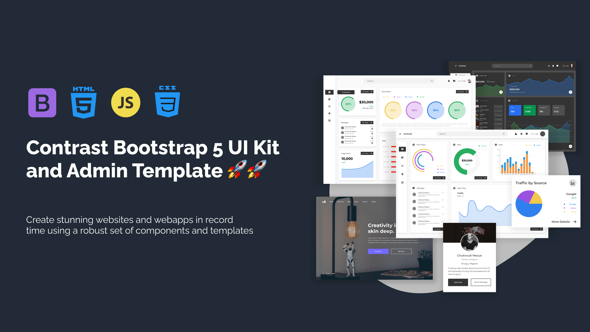
Contrast Bootstrap PRO consists of a Premium UI Kit Library featuring over 10000+ component variants.
Which even comes bundled together with its own admin template comprising of 5 admin dashboards and 23+ additional admin and multipurpose pages for
building almost any type of website or web app.
See a demo and learn more about Contrast Bootstrap Pro by clicking here.