Visually build tailwind css projects 10x faster using AI
Build Tailwind websites visually and ship projects to production in minutes instead of days. Generates code from your designs to export to your favourite frameworks like React, Vue, Angular.

Bootstrap 5 Badges are used to convey and show messages. Badges can be used to display notifications such as unread messages, missed phone calls, and so on.
Using relative font sizing and em units, the Contrast Bootstrap 5 Badge scales to fit the size of the immediate parent element.
<button class="btn btn-dark"> Notifications <span class="badge bg-light text-dark ms-2">4</span> <span class="badge bg-primary">Primary</span> <span class="badge bg-secondary">Secondary</span> <span class="badge bg-success">Success</span> <span class="badge bg-danger">Danger</span> <span class="badge bg-warning text-dark">Warning</span> <span class="badge bg-info">Info</span> <span class="badge bg-light text-dark">Light</span> <span class="badge bg-dark text-light">Dark</span></button>The Contrast Bootstrap 5 Badge adds a class of badge-pill to your span. This gives the badges a more rounded appearance.
<span class="badge badge-pill bg-primary">Primary</span><span class="badge badge-pill bg-secondary">Secondary</span><span class="badge badge-pill bg-success">Success</span><span class="badge badge-pill bg-danger">Danger</span><span class="badge badge-pill bg-warning text-dark">Warning</span><span class="badge badge-pill bg-info">Info</span><span class="badge badge-pill bg-light text-dark">Light</span><span class="badge badge-pill bg-dark text-light">Dark</span>To define the size of Contrast Bootstrap badge , give your span element a class of badge and append the size code of the badge you want (lg for a large badge, and sm for small). For example <span class="badge badge-lg ">Large</span>.
<span class="badge badge-lg bg-primary">Large</span><span class="badge bg-secondary">Normal</span><span class="badge badge-sm bg-success">Small</span>To remove shadows from your badges, use the badge-flat class.
<div> <span class="badge badge-flat bg-dark">Flat Badge Dark</span> <span class="badge badge-flat bg-primary">Flat Badge Primary</span> <span class="badge badge-flat bg-secondary">Flat Badge Secondary</span> <span class="badge badge-flat bg-success">Flat Badge Success</span> <span class="badge badge-flat bg-danger">Flat Badge Danger</span> <span class="badge badge-flat bg-warning">Flat Badge Warning</span> <span class="badge badge-flat bg-info">Flat Badge Info</span></div>We can nest the icon element in our badge span to allowus use icons in our badges.
<span class="badge bg-primary"><i class="fa fa-facebook"></i></span><span class="badge bg-secondary"><i class="fa fa-snapchat-ghost"></i></span><span class="badge bg-success"><i class="fa fa-anchor"></i></span><span class="badge bg-danger"><i class="fa fa-twitter"></i></span><span class="badge bg-warning text-dark"><i class="fa fa-bomb"></i></span><span class="badge bg-info"><i class="fa fa-heart"></i></span><span class="badge bg-light text-dark"> <i class="fa fa-btc"></i></span><span class="badge bg-dark text-light"><i class="fa fa-apple"></i></span>Build Tailwind websites visually and ship projects to production in minutes instead of days. Generates code from your designs to export to your favourite frameworks like React, Vue, Angular.
Trying to create components and pages for a web app or website from
scratch while maintaining a modern User interface can be very tedious.
This is why we created Contrast, to help drastically reduce the amount of time we spend doing that.
so we can focus on building some other aspects of the project.
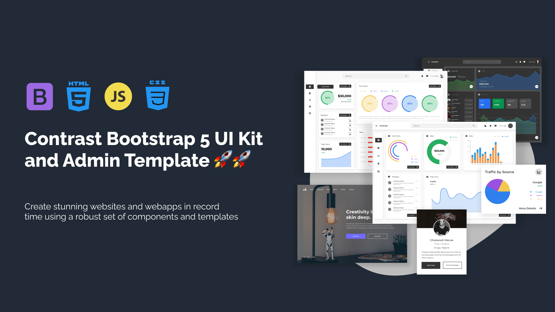
Contrast Bootstrap PRO consists of a Premium UI Kit Library featuring over 10000+ component variants.
Which even comes bundled together with its own admin template comprising of 5 admin dashboards and 23+ additional admin and multipurpose pages for
building almost any type of website or web app.
See a demo and learn more about Contrast Bootstrap Pro by clicking here.