EditableTable
React Bootstrap 5 EditableTable
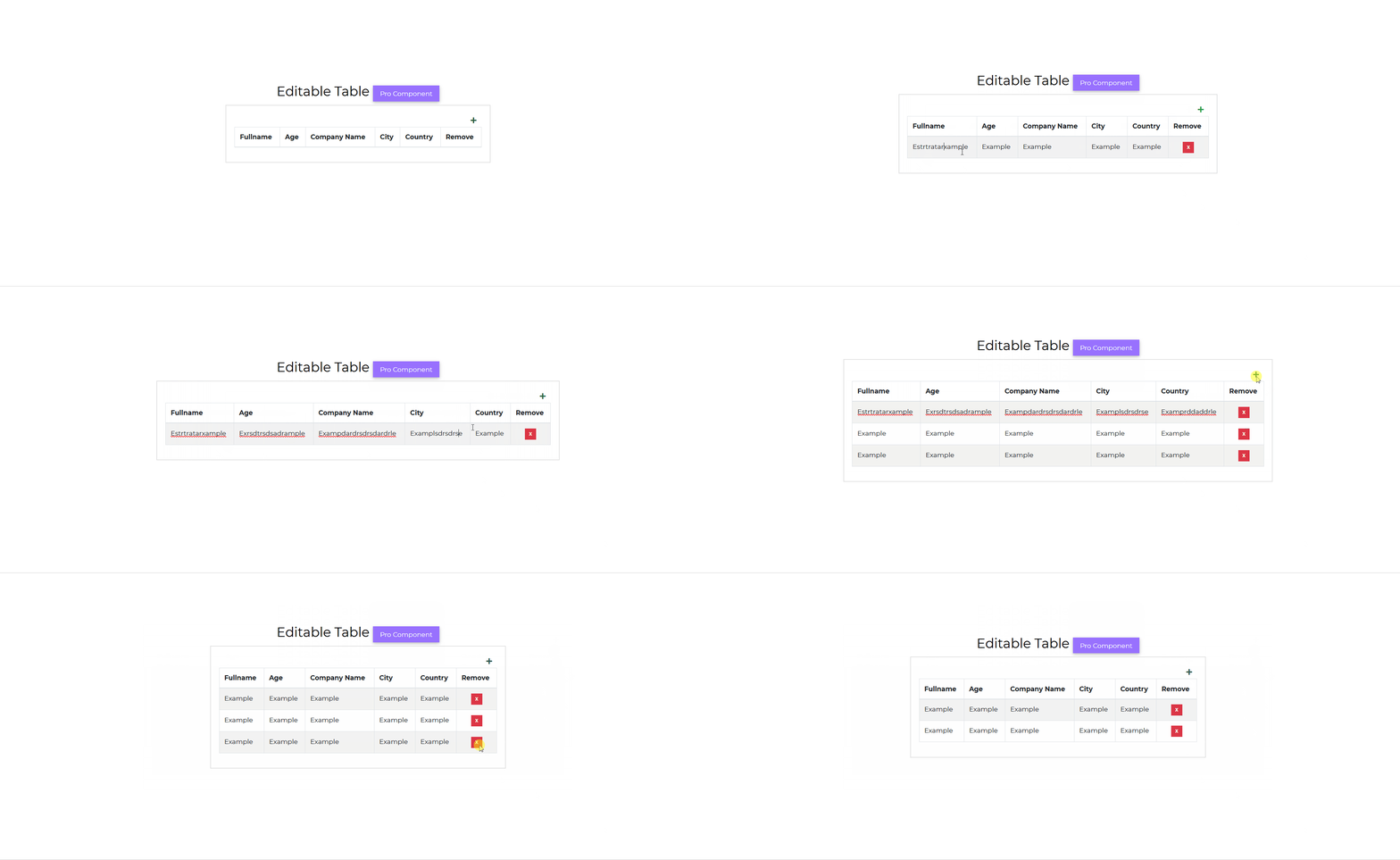
The Contrast React Bootstrap 5 Editable component allows you to create tables you can edit on the website. You can add and remove rows, change texts and informaton within cells.
Importing the React Bootstrap 5 EditableTable Component
To use the Contrast React Bootstrap 5 EditableTable component, you import CDBTimePicker into your project.
import { CDBEditableTable } from "cdbreact";Default EditableTable
Pro ComponentIn this tutorial we use the CDBCard component for the table body. Check out the docs for more understanding.

import React from "react";import { CDBEditableTable, CDBCard, CDBCardBody, CDBContainer } from "cdbreact";
export const EditableTable = () => {  const columns = ["Fullname", "Age", "Company Name", "City", "Country"];
  const data = [    ["Guerra Cortez", 45, "Insectus", "San Francisco", "USA"],    ["Elisa Gallagher", 31, "Portica", "London", "United Kingdom"],    ["Aurelia Vega", 30, "Deepends", "Madrid", "Spain"],    ["Guadalupe House", 26, "Isotronic", "Berlin", "Germany"]  ];
  return (    <CDBContainer>        <CDBCard>          <CDBCardBody>            <CDBEditableTable striped bordered data={data} columns={columns}/>          </CDBCardBody>        </CDBCard>    </CDBContainer>  );};
API Reference: Contrast React Bootstrap 5 EditableTable Props
This section will build on your information about the props you get to use with the Contrast React Bootstrap 5 EditableTable component. You will find out what these props do, their default values, and how you would use them in your code.
The table below lists other prop options of the CDBEditableTable component.
| Name | Type | Default | Description | Example |
|---|---|---|---|---|
| className | String | Adds custom classes | Adds custom classes | <CDBEditableTable className="myClass" ... /> |
| tag | String | div | Changes default input tag | <CDBEditableTable tag="input" ... /> |
| autoWidth | Boolean | false | Adds w-auto to the className | <CDBEditableTable autoWidth .../> |
| bordered | Boolean | false | Adds borders on all sides of the table and cells. | <CDBEditableTable bordered .../> |
| borderless | Boolean | false | Removes borders on all sides of the table and cells. | <CDBEditableTable borderless .../> |
| data | Array | Binds your data into the component. | <CDBEditableTable data = {['Aurelia Vega', 30, 'Depends']} .../> | |
| columns | Array | Specify headers and number of columns | <CDBEditableTable columns={['Person Name', 'Age', 'Company Name']} .../> | |
| hover | Boolean | false | Enables a hover state on table rows within a table body. | <CDBEditableTable hover .../> |
| responsive | Boolean | Makes table responsive across all viewports | <CDBEditableTable responsive .../> | |
| responsiveSm | Boolean | Makes table responsive up to the small breakpoint | <CDBEditableTable responsiveSm .../> | |
| responsiveMd | Boolean | Makes table responsive up to the medium breakpoint | <CDBEditableTable responsiveMd .../> | |
| responsiveLg | Boolean | Makes table responsive up to the large breakpoint | <CDBEditableTable responsiveLg .../> | |
| responsiveXl | Boolean | Makes table responsive up to the extra large breakpoint | <CDBEditableTable responsiveXl .../> | |
| hover | Boolean | false | Enables a hover state on table rows within a table body. | <CDBEditableTable hover .../> |
| small | Boolean | false | Makes tables more compact by cutting cell padding in half. | <CDBEditableTable small .../> |
| striped | Boolean | false | Adds zebra-striping to any table row within the table body. | <CDBEditableTable striped .../> |
Build modern projects using Bootstrap 5 and Contrast
Trying to create components and pages for a web app or website from
scratch while maintaining a modern User interface can be very tedious.
This is why we created Contrast, to help drastically reduce the amount of time we spend doing that.
so we can focus on building some other aspects of the project.
Contrast Bootstrap PRO consists of a Premium UI Kit Library featuring over 10000+ component variants.
Which even comes bundled together with its own admin template comprising of 5 admin dashboards and 23+ additional admin and multipurpose pages for
building almost any type of website or web app.
See a demo and learn more about Contrast Bootstrap Pro by clicking here.