Dark alert! fill in the forms.
Info alert! check out some important information
Success alert! registration complete
Danger alert! Fill in the forms
Warning alert! some filds are missing
Alerts are used to convey important information or notifications to users in a visually appealing and user-friendly manner. Tailwind CSS simplifies the process of creating and styling alerts by offering pre-defined utility classes.
The Tailwind Alert Component is a simple yet powerful component that allows you to easily display important messages, notifications or warnings on your screen. There have multiple colors, styles available.
Basic alerts shows a simple, clean alerts with basic styling. You can use it for general information or notifications.
This alets have a lighter or softer colors. Light-colored alerts can be used for less critical messages, maintaining a subtle and aesthetically pleasing appearance.
Icon Alerts enhances the visual appeal and communication of your alerts by incorporating icons.
Action Alert button allows users to take immediate actions in response to the displayed message. This can enhance interactivity and user engagement.
Alert with link allows hyperlinks within alerts, providing users with the option to navigate to relevant pages or resources. This can be useful for directing users to additional information or actions.
A new software update is available. See what's new in version 3.0.7
Adding list items to an alert makes it possible to present information in a structured and organized format. This can be particularly useful for conveying multiple pieces of related information. The example below shows an example of Alert with a lists:
Dismissing alert shows alerts that has a dismissing button or an "x" at the end of the alert. This feature helps in managing the display of alerts and ensures a seamless user experience by allowing users to remove or hide alerts when they are no longer relevant. Below is an example of a dismissing alert:
Alert with description provides more details about an alert. The description is placed below the main message and typically used for additional explanations. You can also add links within the description if needed. Below is an example of an Alert with description
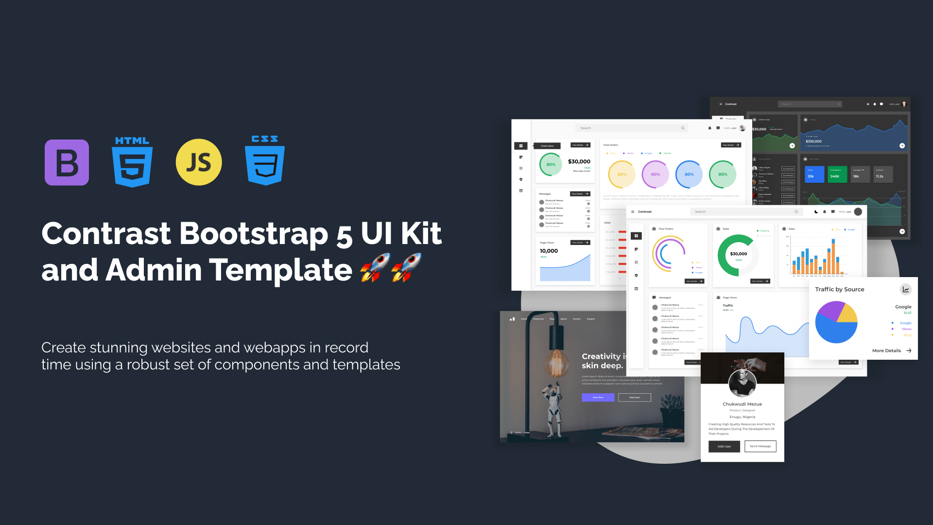
Trying to create components and pages for a web app or website from
scratch while maintaining a modern User interface can be very tedious.
This is why we created Contrast, to help drastically reduce the amount of time we spend doing that.
so we can focus on building some other aspects of the project.
Contrast Bootstrap PRO consists of a Premium UI Kit Library featuring over 10000+ component variants.
Which even comes bundled together with its own admin template comprising of 5 admin dashboards and 23+ additional admin and multipurpose pages for
building almost any type of website or web app.
See a demo and learn more about Contrast Bootstrap Pro by clicking here.