Tailwind CSS Progress Bar
Progress bars are a great way to visually represent the completion status of a task or process. With the power of Tailwind CSS, we can easily customize and style progress bars to fit our design needs. There are different sizes, colors and styles.
Basic Progress Bar
The progress bar fills the container from 0% to 100%. These basic progress bars are effective for indicating the progression of a task or process without additional embellishments.
Progress bar Size
Tailwind allows customization of the height of progress bars, providing flexibility in design. Developers can adjust the height to match the overall aesthetic of their application or to emphasize the progress element.
small Size
Default Size
Large Size
Progress bar with Label inside
Progress bar with label inside is essential in providing users with textual information about the progress percentage directly inside the visual indicator. Below is an example of a progress bar with a label inside.
25%
50%
75%
100%
Progress bar with floating label
Progress bar with Floating label provides a more distinct design that can enhance the visibility of progress information and create a modern and dynamic user interface. Below is example of a progress bar with floating label built with tailwind css.
10%
25%
50%
100%
Progress bar with different colors
The Progress bar with different colors uses different color-coded indicators for different types of progress or statuses. This adds a visual dimension to the information conveyed by the progress bar. Below is an example of progress bar with different colors:
Progress bar with label at the end
Progress with label at the end is beneficial when highlighting the final completion percentage, making it easily noticeable to users. Here is an example of a Progress bar with label at the end:
25%
50%
75%
80%
80%
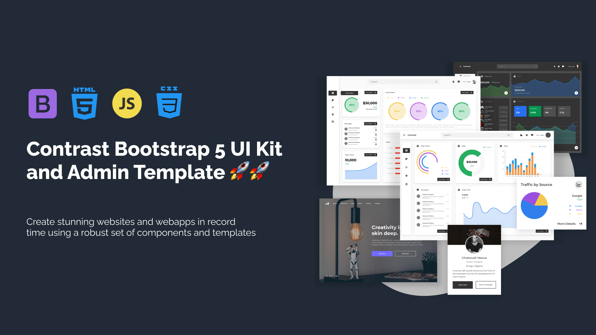
Build modern projects using Bootstrap 5 and Contrast
Trying to create components and pages for a web app or website from
scratch while maintaining a modern User interface can be very tedious.
This is why we created Contrast, to help drastically reduce the amount of time we spend doing that.
so we can focus on building some other aspects of the project.
Contrast Bootstrap PRO consists of a Premium UI Kit Library featuring over 10000+ component variants.
Which even comes bundled together with its own admin template comprising of 5 admin dashboards and 23+ additional admin and multipurpose pages for
building almost any type of website or web app.
See a demo and learn more about Contrast Bootstrap Pro by clicking here.