Tailwind CSS Tab
Tabs are UI elements that allow users to switch between different views or sub-pages of content within the same webpage or application. They are an effective way to organize and manage multiple sections of content while saving space.
Basic Tabs
Basic tabs allow users to switch between different sections of content.
Tabs with Icons
Tabs with icons use visual indicators along with text labels to represent the content of each tab.
Underlined Tabs
Underlined tabs use a line beneath the active tab to indicate which content view is currently displayed.
Side Tabs
Side tabs have a vertical orientation, with the tab items arranged vertically along the side of the content sections.
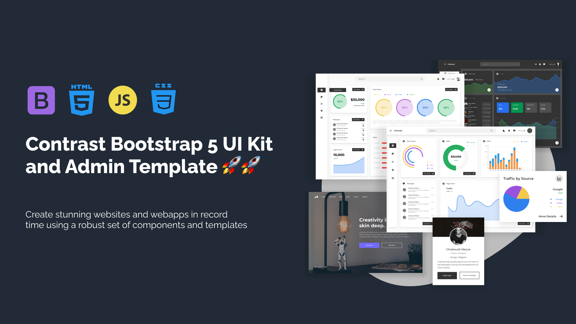
Build modern projects using Bootstrap 5 and Contrast
Trying to create components and pages for a web app or website from
scratch while maintaining a modern User interface can be very tedious.
This is why we created Contrast, to help drastically reduce the amount of time we spend doing that.
so we can focus on building some other aspects of the project.
Contrast Bootstrap PRO consists of a Premium UI Kit Library featuring over 10000+ component variants.
Which even comes bundled together with its own admin template comprising of 5 admin dashboards and 23+ additional admin and multipurpose pages for
building almost any type of website or web app.
See a demo and learn more about Contrast Bootstrap Pro by clicking here.